Lighting basics for health care facilities
Artificial lighting in healthcare facilities must be designed to match the particular tasks and the atmosphere in these facilities. Artificial lighting as well as room colour design and sufficient daylight supply not only promote effortless and accurate execution of work-related visual tasks but also fulfil diverse needs of patients, staff and visitors in terms of comfort, well-being and therapy support.
Design and lighting of rooms exclusively used for patient stays and not for examination or treatment (day rooms, waiting rooms etc.) must primarily fulfil physiological and psychological patient perception needs. This is why, besides suitable lighting, room colours and the colour rendering index of light sources play a significant role here. Problems with ideal lighting design always arise where the visual tasks of the treating personnel and the needs of sensitive, ill persons are conflicting. Physician and personnel requirements for good visual conditions are dominant e.g. in the OR tract. However, even in those areas, patient perception should be considered as much as possible. In ward rooms, however, patient needs prevail, unless treatment or emergencies temporarily force the prioritisation of lighting requirements of the medical staff. Ideal compliance with such contrasting requirements is facilitated by installing several lighting systems and should be aspired to regarding patient-friendly and economic operating sequences.
Lighting design and implementation in geriatric care and similar facilities require particular attention (see also chapter "Lighting of geriatric care and nursing facilities" as well as chapter "Light and non-visual effects"). This particularly applies to symptoms that feature in dementia and Parkinson’s.
Due to special hygienic requirements, sufficient lighting for cleaning purposes is also required in all areas.
The light colour of the light sources used determines, among other things, the colour climate of the room and has effects on mood and well-being. For lighting requirements primarily geared towards comfort, it should be warm white (colour temperature < 3.300 K), while primarily work-related room use should be provided with colour temperatures between 3.300 K and 5.300 K. In rooms with increased requirements concerning colour recognition, e.g. in dermatologists’ or dentists’ examination and treatment rooms, daylight-white light (colour temperature > 5.300 K) with an elevated colour rendering index Ra > 90 may also be required.
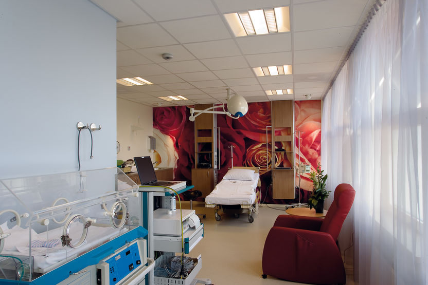
Light and colour in hospitals have long replaced the sterile white of the past - interior design and its effect is now a normal consideration. The interplay of person and space promotes well-being of patients in the care area as well as calm and optimism in the treatment area of the hospital and thus promotes therapeutic benefits. Familiar and unobtrusive primary colours, simple and more vividly coloured shapes (circles, squares, triangles), a harmonious design and familiar materials (wood, glass, metal, stone) are proven elements for this purpose.
For example, ward rooms are increasingly designed in a hotel room fashion regarding materials, light and colour. Warm pastel tones and positive colour themes on the walls combined with warm light colours and decorative light accents create a calming, liveable and still functional atmosphere e.g. in delivery rooms. In operating theatres, colour is also used as a design element. It is perceived as comforting by patients and treating personnel alike. Corridors and common areas are used for communicative purposes by patients, visitors and treatment personneland, in some cases places of work. Colourful design or slow changes in general light colour can serve to improve acceptance of what used to be perceived as mundane traffic routes.